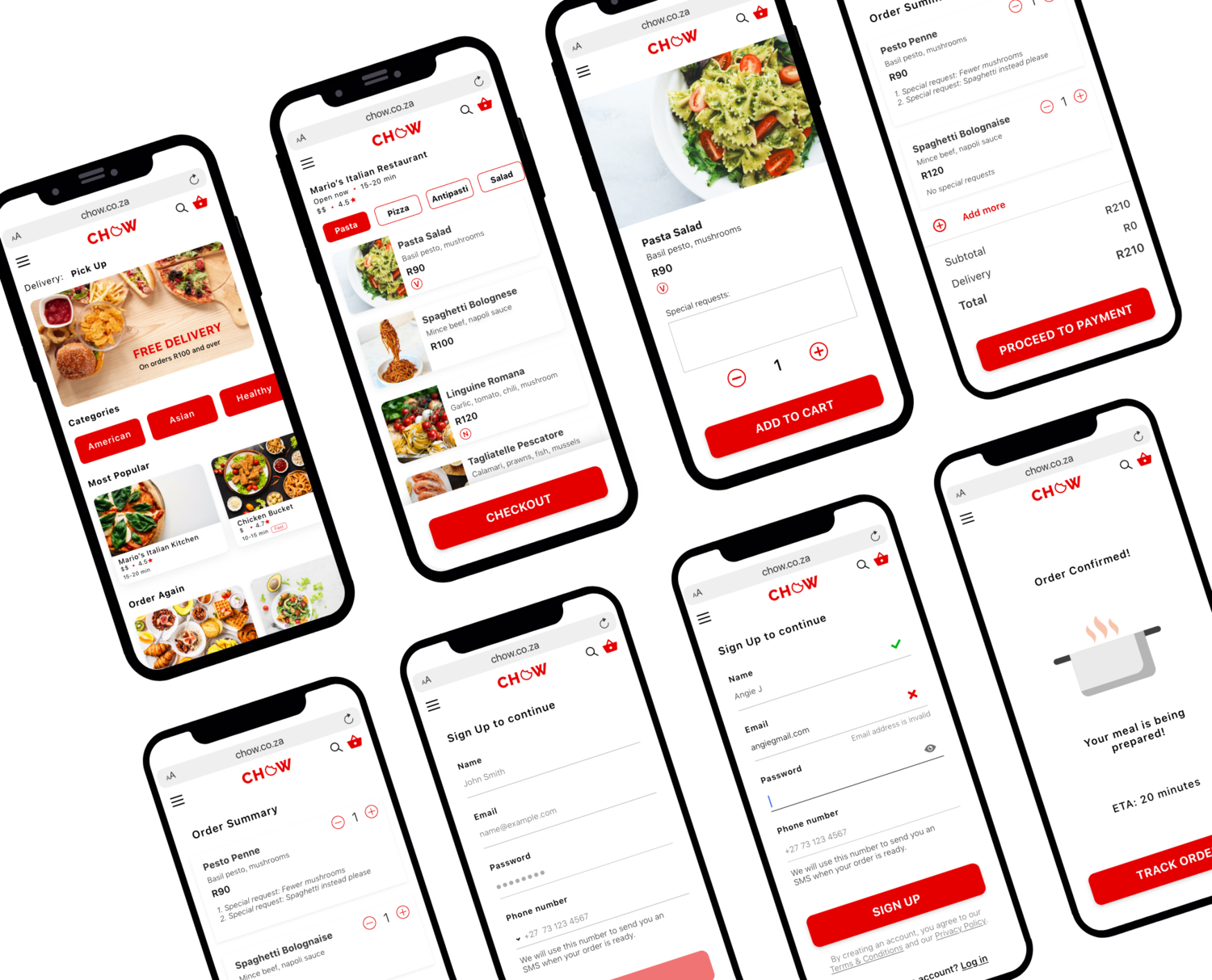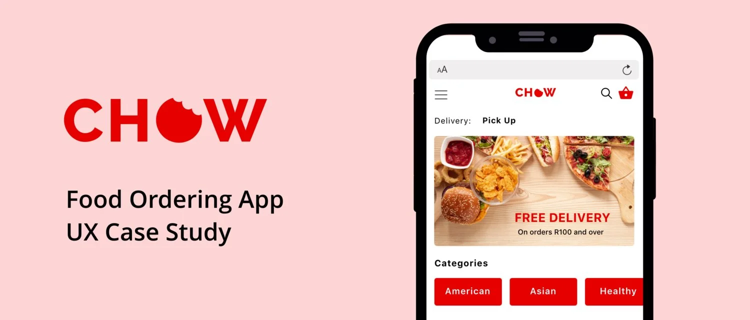
Chow is a food delivery app that I designed as part of a 7-day UX challenge. I was given a project brief and a task to complete daily. At the end of the 7 days, I had the basic outlines of a restaurant app. I later went back to change and refine my design to a food delivery app, which I believe could better serve my user.
Duration: 7 Days
Role: Journey Mapping, Solution Sketching, Wireframing, UI Design
Tools: Adobe XD
PROBLEM
Our user needs a way to order food to eat at home. She wants to be able to drive and pick up her order and spend as little time as possible waiting at the restaurant.
During the 7 day challenge, I chose to focus on a web app for a single restaurant. After the challenge, however, I thought it would be interesting to design a platform for a food ordering service. I conducted some additional research and changed the tasks I had completed in the challenge.
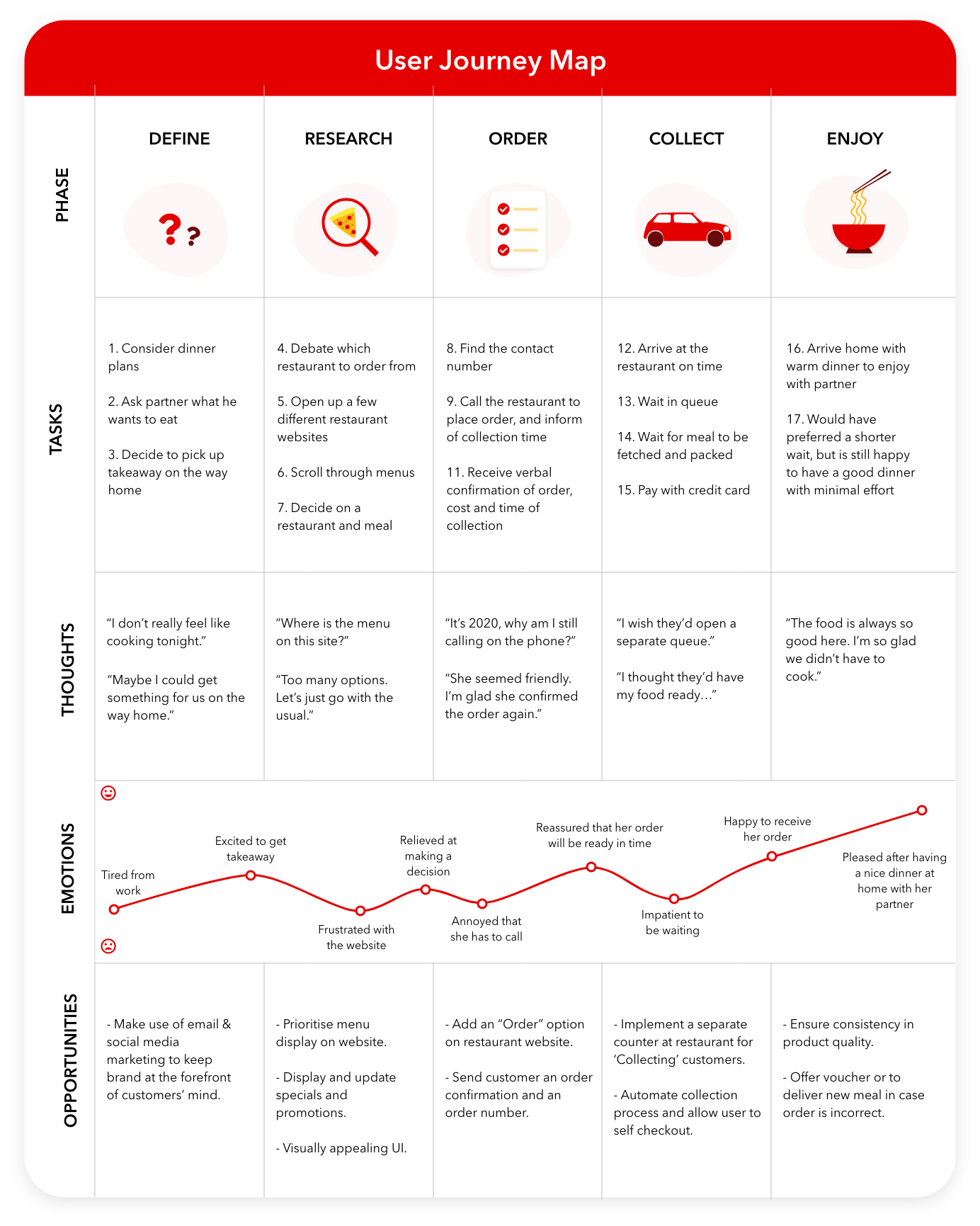
USER JOURNEY MAPPING
On the first day of the challenge, I created a customer journey map to better understand my user and inform my design process. To do this, I reached out to a few friends to ask how they commonly ordered food. Surprisingly, many still called their local restaurant directly to place an order because these restaurants weren’t on existing food delivery platforms, but they would prefer being able to order online. I decided to incorporate this into my user journey.
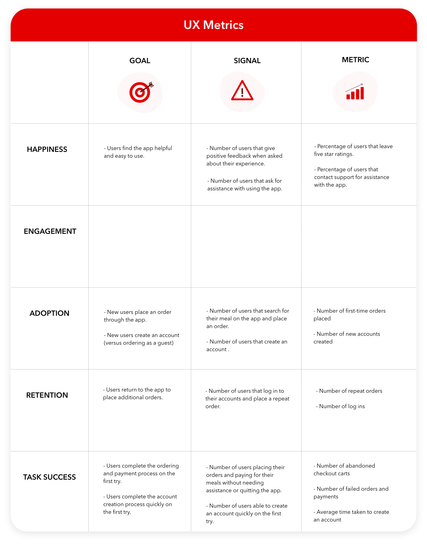
DEFINING SUCCESS
Once I had a clearer idea of the problem, day two was about defining how success would be measured. To do this, we were encouraged to use a combination of Google’s HEART framework as well as the Goals-Signals-Metrics (GSM) process to ensure a shared understanding of what success looks like.
CRAZY 8’s
On day three, I began to tackle potential solutions to our user’s problems. First, I spent some time researching existing products and websites within the restaurant industry and I reviewed their existing problems and solutions. Next, I spent 8 minutes creating 8 rough sketches to push beyond my existing ideas.
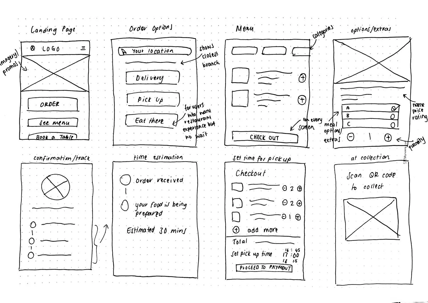
SOLUTION SKETCHING
Day four’s task was about focusing and refining some ideas created in the crazy 8’s session. I chose to dive deeper into three screens that I believed were most important to demonstrate the user’s journey - namely an individual restaurant menu, meal product and checkout. I chose to keep these sketches low fidelity with additional annotations on the side. I wanted to focus less on the visuals and more on using this as a communication tool that could be shared with stakeholders.

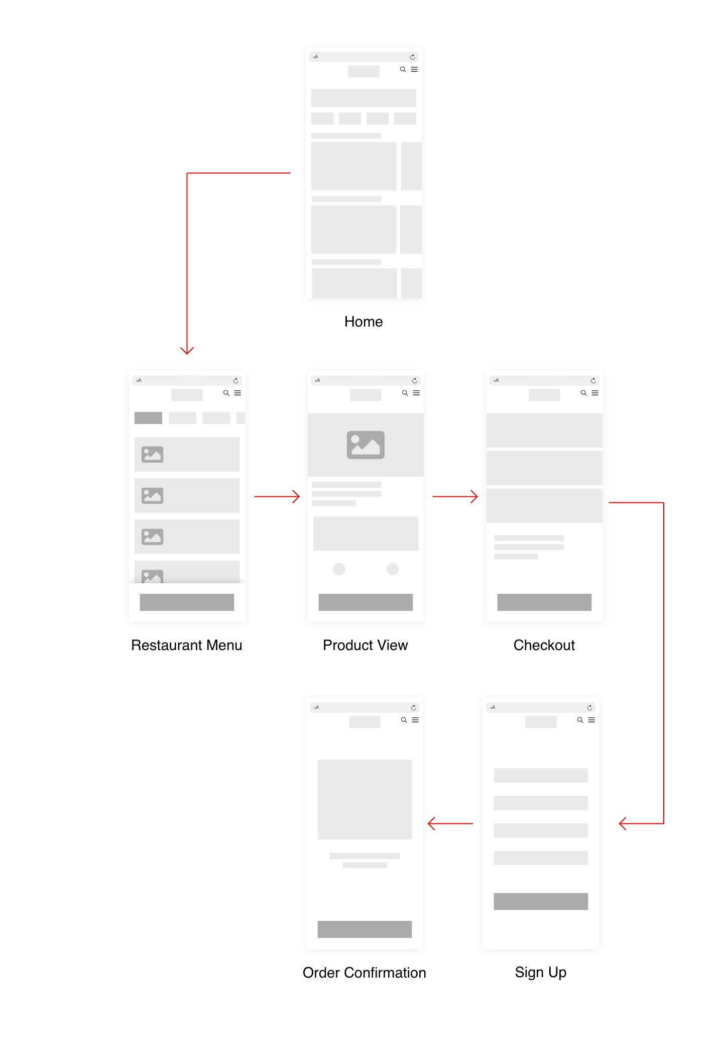
LO-FI WIREFRAMES
On day five, I focused on creating more detailed wireframes that would convey my ideas more clearly. I kept my designs minimal and consistent and made use of grids and hierarchy guidelines to help where I put everything on my screens.
HI-FI WIREFRAMES
On day five, I focused on creating more detailed wireframes that would convey my ideas more clearly. I kept my designs minimal and consistent and made use of grids and hierarchy guidelines to help where I put everything on my screens.
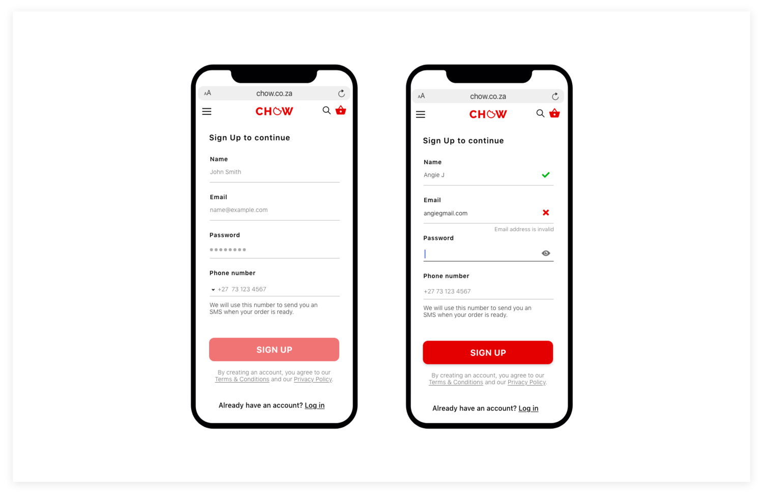
UI DESIGN
On the last day, I focused on UI design elements for my remaining screens. I added minimal, high-quality images that had ample whitespace for promotional text, and added colour. I made use of a vibrant red that is commonly associated with triggering stimulation and appetite and makes for attention-grabbing branding.
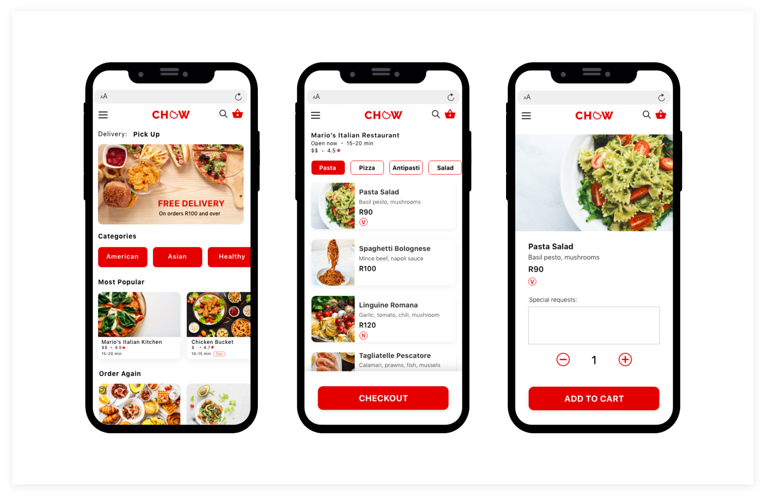
FINAL PRODUCT
By the end of the week-long challenge, I had designed screens that would allow my user to search for her favourite meal, place an order, pay, and specify her collection or delivery method.