How might we reimagine the future of television?
TV Guide makes TV decision-making easier, faster and more informative, making it the best place to discover what to watch, where to watch, anytime, anywhere. It is a project I completed as part of my Professional UX Design Certificate Course with Coursera. As the sole UX Designer, I led this project's ideation, strategy and design, taking it from inception to final design.
Duration: Four Months
Role: User Research, Journey Mapping, Wireframing, Screen Flows, Visual Design
Tools: Adobe XD
PROBLEM
Today, TV is about choice, and for most viewers, there are a lot more choices than ever before. TV is now being watched in more than one place and being offered by more than one provider, and while this abundance of media content is good, the fragmentation of various sources and media devices has made it increasingly harder for users to discover and manage the content they’re interested in.
KEY DRIVERS
As the density of online content increases and consumers are overloaded with choices, the ability to find and access content across a myriad of services is crucial to the success of the app. I based my designs to deliver upon the following key areas:
UNIVERSAL SEARCH
A universal search that unifies content from multiple services and streaming providers (Netflix, Prime, BBC, Sky etc.), providing a single point of entry to discover new content.
PERSONALISATION
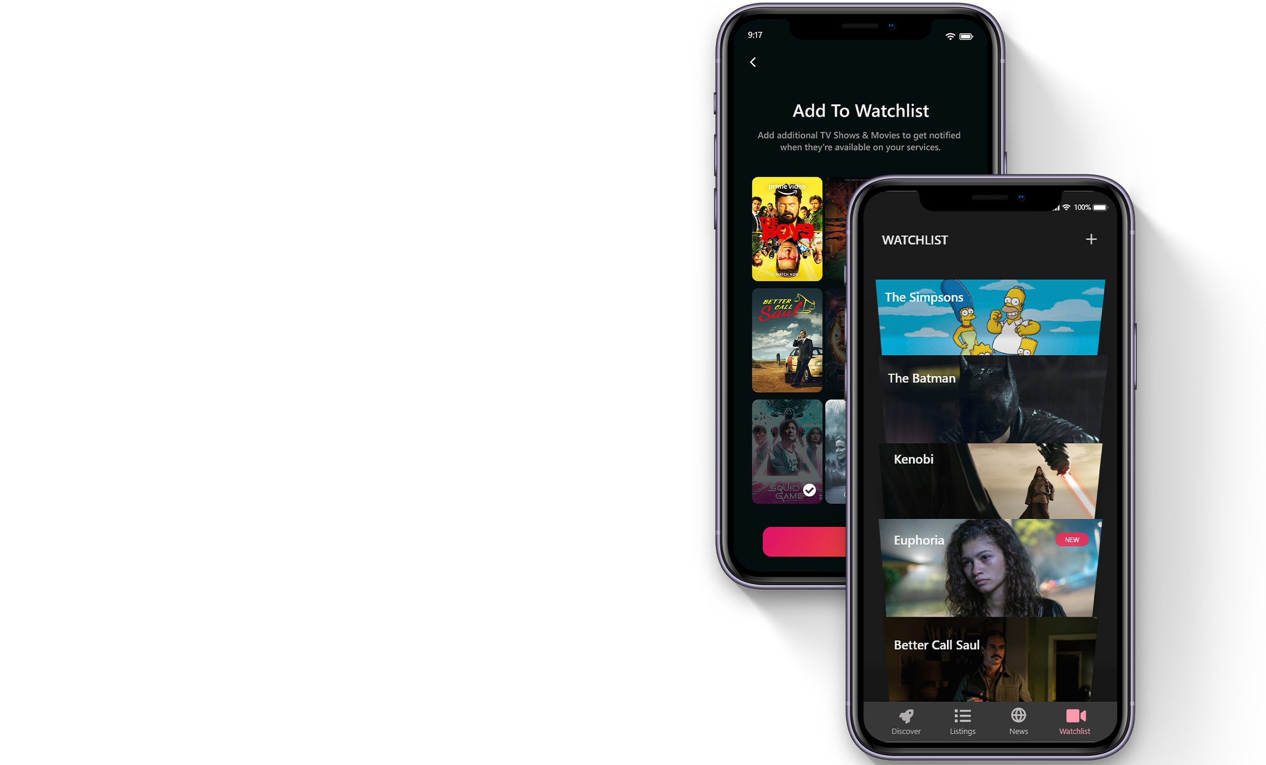
A watchlist that notifies users of any upcoming releases and content from services they are subscribed to, allowing curation of personalized content.
SMART RECOMMENDATIONS
Offering users smart recommendations based on their preferences and watching habits, enabling tailored content.
WHAT DOES THE TV LANDSCAPE LOOK LIKE?
I wanted to get a clear picture of how users went about discovering new shows and movies. To get a better understanding of their behaviours and motivations, here are some research techniques I used for the design.
METHOD #1:
QUALITATIVE & QUANTITATIVE DATA
By performing in-person interviews and conducting surveys, I learnt existing user behaviours for show discovery and management. Some of the learnings are shared below.
METHOD #2:
USER REVIEWS ON APP STORES
I sifted through hundreds of reviews and comments left by users on the Play Store and Apple Store for similar apps, further categorized them under buckets and highlighted them in terms of importance. There was some crucial feedback that helped me identify various user pain points and areas of improvement.
“Mobile respondents report higher levels of influence and are more dependent on their phones and social media”.
The digitisation of TV has significantly changed viewing patterns, the nature of the content and its delivery. The interruptive ads of today have given way to more engaging content, as new technologies enable audiences to skip content that they don’t want to engage with. Certain programmes, however, remain in linear form – including news, live sports and big events. Other than that, everything else is shifting to video-on-demand (VOD).
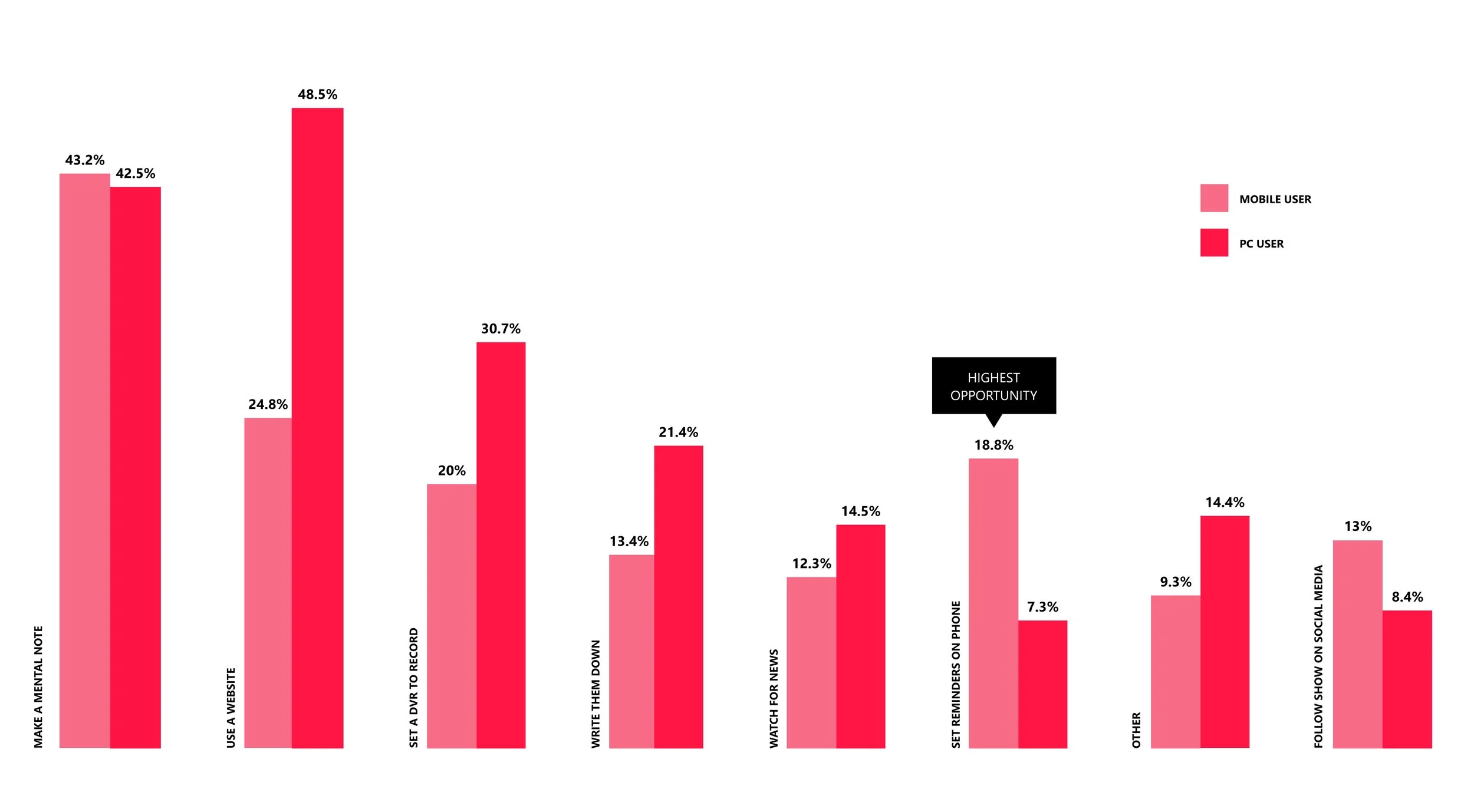
USER ATTITUDES TOWARDS KEEPING TRACK OF THEIR FAVORITE TV SHOWS (SURVEY)
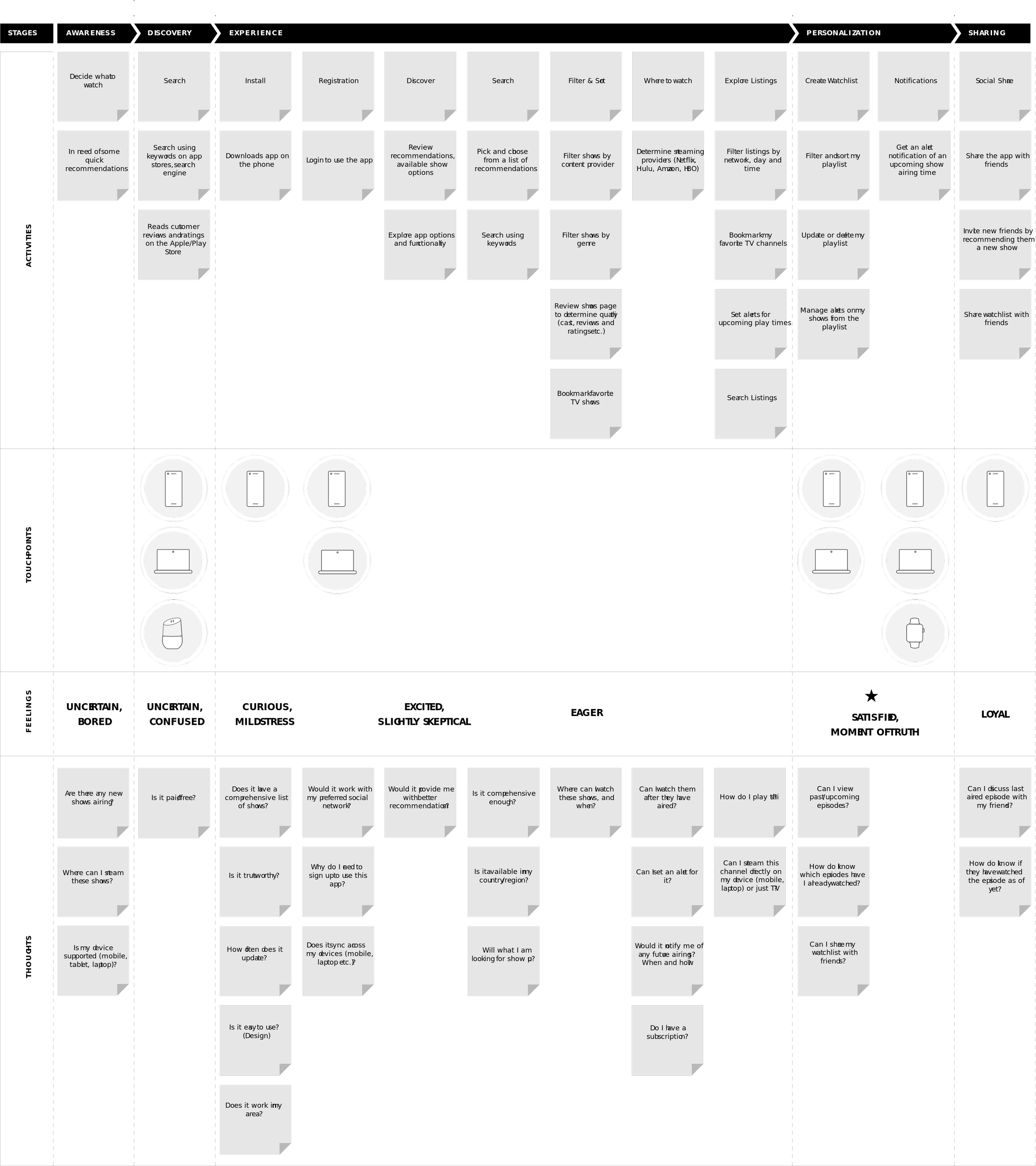
JOURNEY MAPPING
Based upon data from in-person interviews, surveys and user reviews, I organized my observations and categorized them using a customer journey map. This helped me expose pain points and areas for improvement in the app along the entire user journey. I identified various touch-points by intent and task including aspects such as emotions and expectations.
SETTING UP THE STRUCTURE
I refined the concept with research outcomes in-line with business goals and went through a few rounds of iteration using hand sketching. I also came up with a revised and simplified information architecture that focused on content discovery, TV listings and easy management of shows.

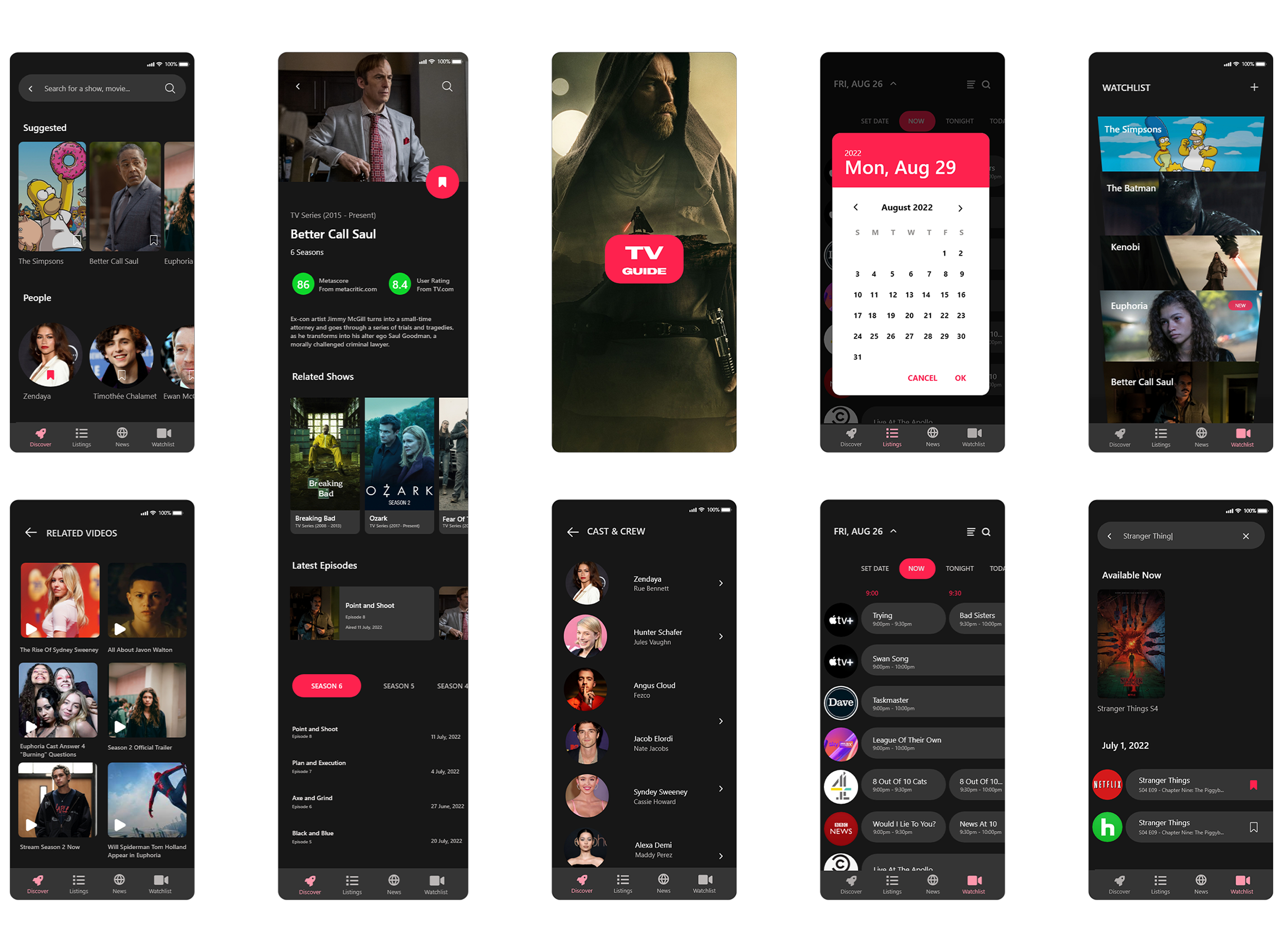
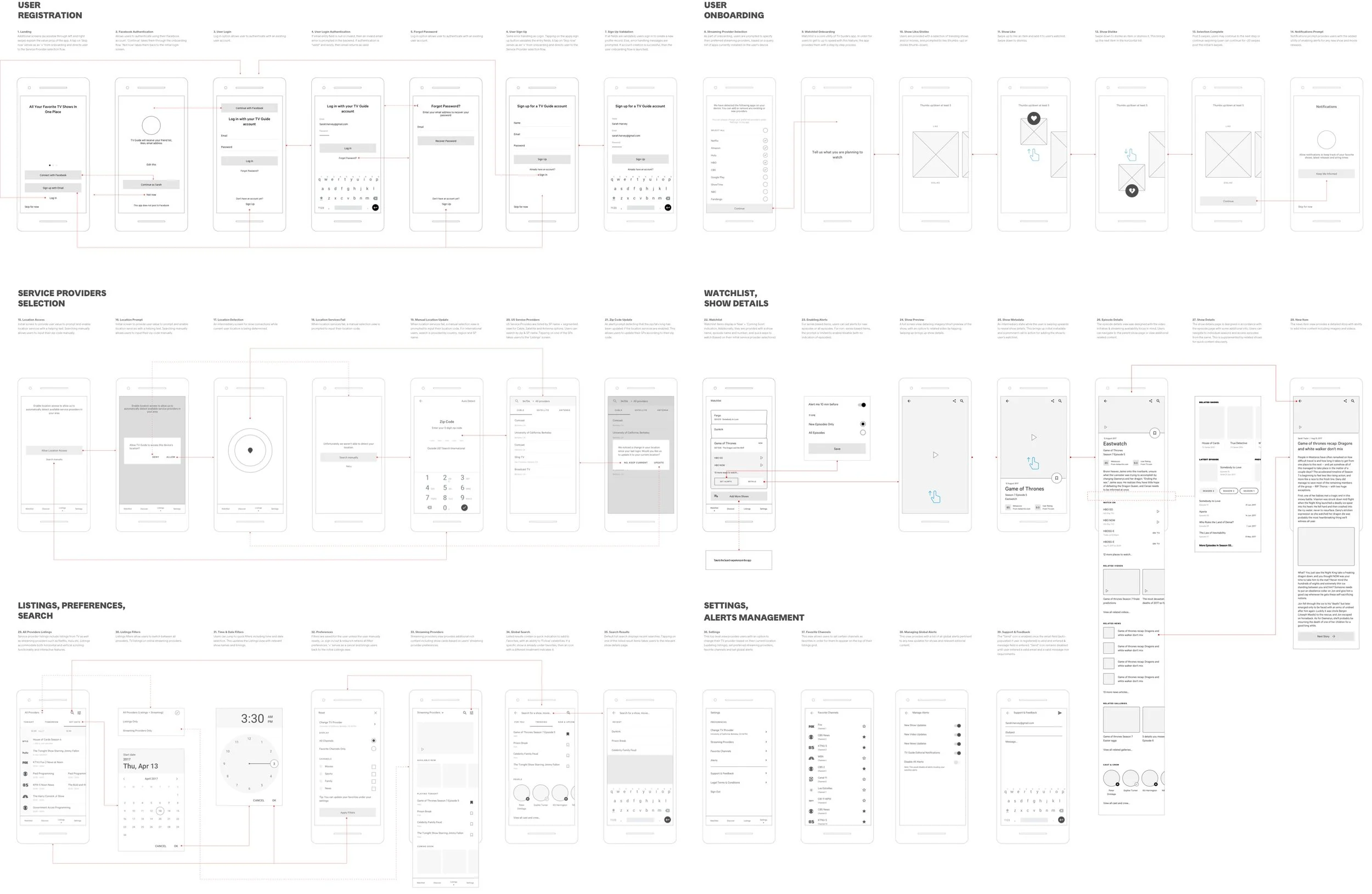
WIREFRAMES
I sketched countless ideas, brainstormed various possibilities and created low-fidelity wireframes and prototypes to test. The outcome was four distinct views: watchlist, explore (discovery), TV listings and settings (favourites and alerts management).
VISUAL DESIGN
TV Guide App Design System was built to accommodate scalability, so components can work well alongside each other, at the same time, render well on various device resolutions.
DARK COLOUR SCHEME
Traditionally, TV Guide apps have been accustomed to lighter themes, primarily because most of the content resides on the web. I intentionally chose a dark theme for the app since our users tend to engage in the app much later in the day, and a room with dimmed lights, and thus a brighter theme would have been too harsh on the eyes.
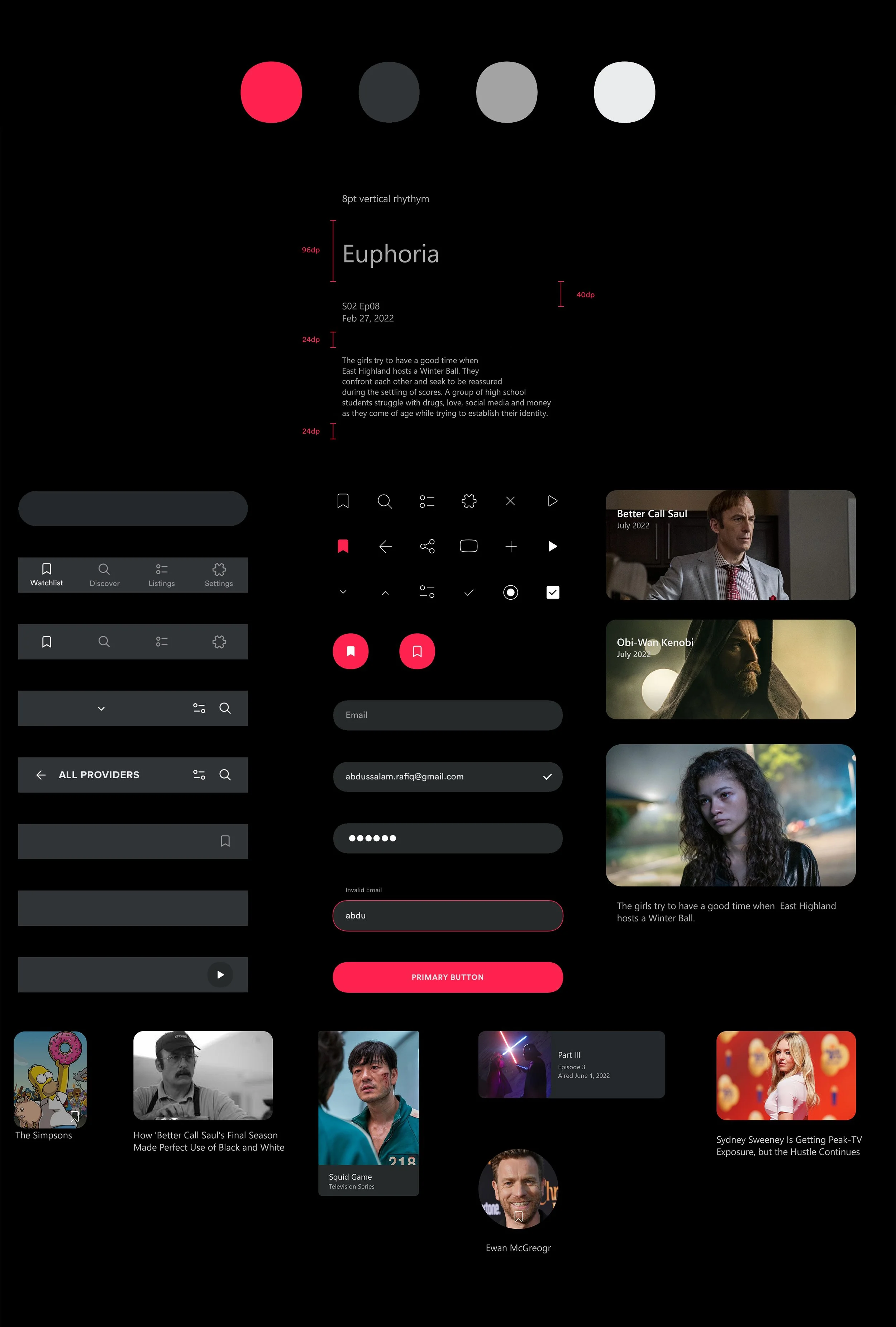
SYMBOLS
I started by building a comprehensive components library within Figma that would later reflect in various parts of the app, i.e., colours, typography, setting the grid etc. This included icons, buttons, form elements, error and empty states, show cards and content cards. For achieving vertical rhythm, I used an 8pt grid system (fonts set at 4pt, UI set at 8pt).
USER ONBOARDING
Watchlist is a core utility of TV Guide’s app — allowing users to add shows/movies and set alerts to be notified of any new releases. For users to get to up to speed with this feature, I designed an experience that was simple, yet fun! I took inspiration from Tinder-style cards where users could swipe up to like a movie/show or swipe down to dismiss it. Any items that were liked were automatically added to the user’s watchlist. Why swipe left or right, when you can always thumb up or down?

PERSONALISATION

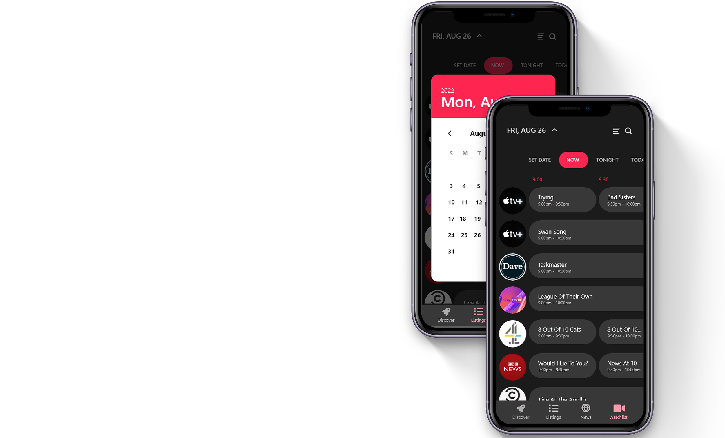
WHAT’S ON TV?

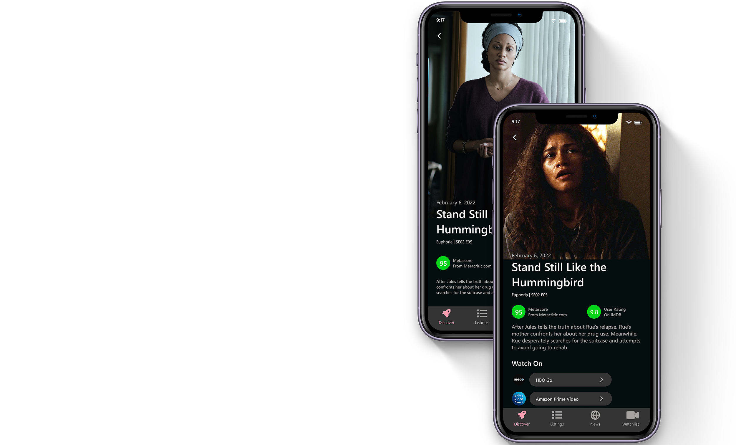
SHOW & EPISODE DETAILS